Dashboards are one of those “looks simple, eats weeks” projects. Most people don’t fail because they can’t make charts—they fail because they pick the wrong dashboard generator for their real constraints: messy data, unclear metrics, stakeholders who change their mind, and zero patience for setup.
This guide is written like an internal checklist: what to use, what to avoid, and the order of decisions that keeps you out of regret. You’ll see screenshots above (one per tool), then practical steps, plus the traps that make an “easy dashboard creator” turn into a maintenance problem.
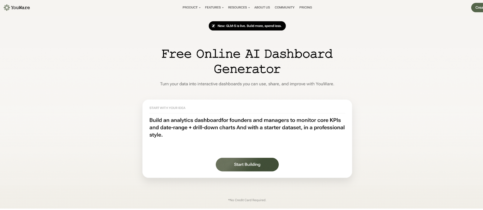
YouWare
Best For: Fast first version, non-technical teams, and anyone who wants an AI dashboard generator that gets to something shareable quickly.
What YouWare Is (In Plain Terms)
YouWare positions its AI Dashboard Generator as “generate in minutes, edit/customize, then publish/share and iterate.” That workflow matters because dashboards don’t stay “done”—they evolve.
Newbie Trap Vs. Correct Way
- Newbie trap: “I’ll generate a perfect dashboard from my spreadsheet.”
If you do that, you’ll likely get a pretty layout that answers the wrong questions (or uses the wrong definitions of KPIs). - Correct way: Decide your 3–5 decision metrics first, then let the tool generate UI around those, not around whatever columns happen to exist.
How To Use YouWare (Step-By-Step)
- Start with a single purpose. Example: “Weekly revenue health check” (not “company performance”).
- Prepare a clean input. One table = one grain (e.g., order-level or day-level), consistent date formats, no duplicate headers.
- Use the AI prompt like a spec. Tell it:
- who the dashboard is for,
- what decisions it should support,
- the metrics + definitions (e.g., “Gross margin = (Revenue-COGS)/Revenue”).
- Generate, then immediately lock layout basics. Headline KPI row → trend charts → breakdowns → filters.
- Publish and share early, then iterate. YouWare explicitly pushes share/review/improve as a loop—use it, don’t “perfect it alone.”
The Pitfalls That Waste Time
- “AI did it, so it must be right.” AI can’t know your internal metric definitions.
- Overstuffing the first version. If you add 20 charts, you guarantee nobody will trust any of them.
- Not planning for change. Your dashboard will become “more important than we thought.” Pick a tool/workflow that tolerates iteration.
Pros
- Fast path to a shareable dashboard + iteration loop (generate → customize → share → improve).
- Friendly if you want a practical “easy dashboard creator” experience.
Cons
- You still need metric definitions and clean data inputs—AI won’t save you from ambiguity.
- If your org needs strict governance/semantic layers, you may outgrow “quick build” workflows.
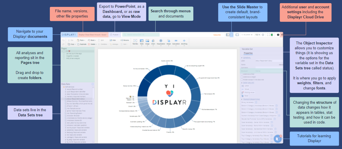
Displayr
Best For: Research/survey-heavy dashboards, teams that want analysis + reporting in one place, and people who value “PowerPoint-like” editing but with real analytical depth.
What Displayr Is
Displayr describes itself as an all-in-one platform: data cleaning, analysis, charts, and reporting—with AI assisting while you stay in control.
It also positions its dashboarding as DIY without technical expertise, in a familiar slide-style environment.
Newbie Trap Vs. Correct Way
- Newbie trap: Treating Displayr like a generic BI tool for every scenario.
If you do that, you’ll likely fight the workflow when your real need is pure operational BI. - Correct way: Use Displayr when you need dashboards that are tightly coupled with analysis (significance tests, segmentation, survey weighting, etc.).
How To Use Displayr (Step-By-Step)
- Import data properly. Surveys/CSV/Excel—confirm variable types early (numeric vs. categorical).
- Build your analysis objects first. Create key tables/charts from the data (don’t start with layout).
- Assemble a dashboard page. Place the visuals, then add filters/controls.
- Make it “live” for the audience. Export or publish as an online report/dashboard, and test with fresh data. Displayr emphasizes dashboards + online reports + exporting options.
The Pitfalls That Waste Time
- Skipping data typing/labels. Your dashboard becomes a mess of cryptic variable names.
- Confusing “interactive” with “useful.” Interactivity is not value—decision clarity is value.
- Forgetting audience constraints. If stakeholders need “one truth,” do not let them self-define metrics per page.
Pros
- Strong for analysis-driven dashboards and research workflows (AI + built-in statistical engine positioning).
- Designed for dashboards/online reports without deep technical setup.
Cons
- May be overkill if you only need operational KPI tiles and simple trend charts.
- Your team still needs discipline in metric definitions and data prep.
Figma
Best For: Designing dashboard UI/UX before building, aligning stakeholders visually, and creating a reusable dashboard design system.
What Figma Is In This Context
Figma isn’t a data-connected dashboard generator. It’s where you design the dashboard interface so engineering/BI work doesn’t become endless UI debates. Templates and chart component libraries can speed this up.
Newbie Trap Vs. Correct Way
- Newbie trap: “We’ll design the dashboard in Figma and we’re done.”
If you do that, you’ll likely end up with a beautiful mock that collapses when real data arrives. - Correct way: Use Figma to validate:
- information hierarchy,
- filtering UX,
- empty/loading/error states,
- and realistic data density.
How To Use Figma For A Dashboard (Step-By-Step)
- Start from a dashboard UI kit/template. Faster than drawing from scratch.
- Define a grid + KPI row rules. (Example: max 5 headline KPIs, each must have a trend or context.)
- Use chart components. Keep chart styles consistent so users don’t re-learn visuals each page.
- Prototype filters and drilldowns. Especially date range, segmentation, and “click to detail.”
- Hand off with specs. Document spacing, typography, states, and components so implementation doesn’t drift.
The Pitfalls That Waste Time
- Designing with fake data that’s too perfect. Real data has long labels, missing values, spikes.
- No state design. If you don’t design “no data / partial data / broken connector,” the product will feel unreliable later.
- Not designing for change. Dashboards evolve—components must be reusable.
Pros
- Best-in-class for visual alignment and preventing “UI bikeshedding.”
- Great for building a reusable dashboard design system with chart libraries.
Cons
- Not a live ai dashboard generator or free dashboard generator by itself.
- You still need a data tool (Looker Studio/Power BI/Tableau/engineering) to make it real.
How To Choose The Best AI Dashboard Generator
Choosing the “best” tool is mostly about avoiding the wrong one. The right order:
- Decide the job: operational monitoring vs. analytical exploration vs. stakeholder reporting.
- Confirm your data reality: one clean source vs. multiple messy sources; refresh needs; governance.
- Pick the workflow: AI-first generation vs. analysis-first building vs. design-first prototyping.
- Only then compare features. Features before workflow is how you buy regret.
Quick Comparison Table (3 Tools)
| Tool | Best Use Case | Learning Curve | Data Connection | Collaboration | “Free” Reality |
| YouWare | Fast first dashboard + iterate | Low | Spreadsheet-to-dashboard flow | Share/review loop | Varies by plan/features |
| Displayr | Research/survey dashboards + reporting | Medium | Strong for analysis/reporting | Team reporting workflow | Commercial |
| Figma | UI prototyping + design system | Medium | Not live data | Excellent | Free tier exists (not a live dashboard tool) |
If you’re searching specifically for a dashboard generator that feels like an online free dashboard creator, Looker Studio is usually the first reality check: it’s widely positioned as easy and free, with lots of connectors.
If your org is already deep in Microsoft, Power BI often becomes the default “access dashboard builder” because of ecosystem and governance patterns.
What Are Benefits Of AI Dashboard Generator?
AI helps most when it reduces “blank page time,” not when it replaces thinking.
Benefits you can actually feel:
- Faster first draft: You get a working layout quicker, instead of debating UI for a week.
- Easier iteration: When stakeholders change metrics (they will), AI-first workflows can accelerate revisions.
- Lower barrier for non-technical teams: Useful if you need a practical generator dashboard workflow without engineering.
- Better stakeholder alignment: A shareable prototype ends arguments faster than slides.
- Path to “dashboard generator free” experiments: You can test whether a dashboard is valuable before committing to enterprise BI. (This is where tools like Looker Studio shine for trials.)
Keywords you’ll see in the wild—dashboard generator free, online free dashboard creator—often mean “free to start, pay to scale/sharing/governance.” Treat “free” as a pilot budget, not a long-term guarantee.
FAQs On Dashboard Generator
1. What Is the Best AI Dashboard Generator?
There isn’t a single “best” tool — it depends on your goal.
- Quick, free, and easy to share: Looker Studio
- Enterprise governance & Microsoft ecosystem: Power BI
- Research-heavy analysis + reporting: Displayr
- AI-first rapid generation & publishing: YouWare
The right choice depends on whether you prioritize speed, governance, advanced analytics, or collaboration.